Typefaces for design use are more than just characters, but are meant to help unify all Tosoh communications in print, web, and other mediums.
Tosoh Corporation requires that all communications materials (internally and externally facing) use the following typefaces when using text in design and web. However, depending on the purpose of the materials, there may be a need to use different fonts while still staying within acceptable corporate parameters.
Font, which is not to be confused with typeface, enables designers and employees alike to ensure that their communications materials reflect the typeface style requirements of the Tosoh Corporation Visual Identity Guidelines.
Please consult the Tosoh Visual Identity Guidelines for a list of acceptable font weights and formats.
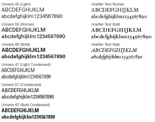
Non-web design use (printed media):
Primary font family (attention grabbing titles, headlines, etc.) -
Univers Secondary font family (body text) -
Hoefler Below is a list of font weights and styles accepted:
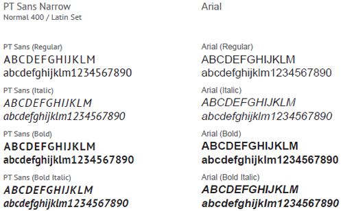
Web design use (webpages):
Primary font family (h1, h2, etc.) -
PT Sans Narrow(Google Web Font)
Secondary font family (p, h3, h4, h5, etc.) -
Arial Below is a list of font weights and styles accepted:
Depending on the type of media that is being produced, designers may use one or a combination of the above, for example:
1) Webpages (of Tosoh websites) may have a banner image made with Univers and Hoefler font families, while for the same page's on-page text, PT Sans Narrow and Arial are to be used.
2) A product catalog may use only Arial in different font weights, sizes and formats: Titles and headings are large bold text; paragraph text is standard size and weight; and citations and notes in small italicized text.
As with all communications materials, review of typefaces and the use of font is managed by Tosoh IPR before release/publication.